
.png)
ブログを書くのに囲み枠なんて事を考えた事もなく、、、
というか知らなかったしすぐ出来るとは思ってもみなかった、、、
と言う事で
今まで嫌々使ってたのを囲み枠に変更しました
CSSですぐに作れますよ
参照したサイト
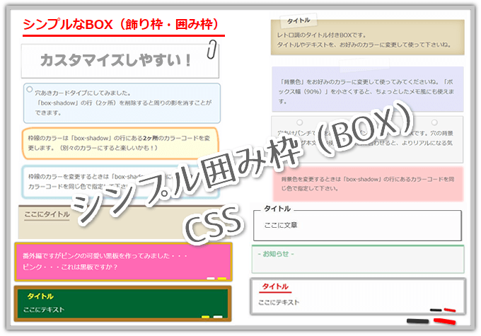
【CSS】シンプルな囲み枠(ボックス)コピペですぐ使える
飾り枠を使って文中や文末に関連記事・まとめ記事、Pickupなど、さり気なく目立たせたい!シンプルで無難な囲み枠・囲い枠(ボックス)を紹介します。CSS・HTMLをコピペでOK!色や太さをお好みでカスタマイズして使って下さいね。新作『黒板風(チョーク付)』と『ホワイトボード風(マーカー付)』自分で作っておいてナンですが…気に入ってます(笑)
色んな囲み枠を作って紹介されています
囲み枠
今まで囲み枠を使っておらず引用を使って形を整えてました
箇条書きを使いつつセンターにしたいって時はやりようがなかったんですよね
↓みたいな感じで引用使ってやってました
- 標高1,404.2m
- 佐々連尾山(さざれおやま)は、愛媛県四国中央市と高知県長岡郡本山町にまたがる山
- 白髪トンネル脇から登り始めるとアスレチック感があり
- 新居浜市の別子銅山に次ぐ産出量の佐々連鉱山が北側中腹にあったが山名の由緒はこれより前か後かは定かでない
- 大ブナの駄場、天空のわさび棚跡がオススメ!!でピークはどうでも良い
- 土佐峰はツツジで有名
- 鹿の角を初めて拾った縁起の良い山
地図と説明の位置関係を綺麗に整えるのに引用を使って整えてました
標高とか確かに引用(調べて)している部分はあるんですが個人の感想がメインなんですよ
それを形式的とは言え引用ってのはなんかね。。。
これを黒板風の囲み枠に変更
- 標高1,404.2m
- 佐々連尾山(さざれおやま)は、愛媛県四国中央市と高知県長岡郡本山町にまたがる山
- 白髪トンネル脇から登り始めるとアスレチック感があり
- 新居浜市の別子銅山に次ぐ産出量の佐々連鉱山が北側中腹にあったが山名の由緒はこれより前か後かは定かでない
- 大ブナの駄場、天空のわさび棚跡がオススメ!!でピークはどうでも良い
- 土佐峰はツツジで有名
- 鹿の角を初めて拾った縁起の良い山
黒板風の囲み枠
※これは変更後の最終Verです
フォントはBloggerの中にあるフォントで手書き風を使って少しでも黒板感を、、、
※独自に追加したフォントではありません
チョーク風のフォント追加して『フォントの種類』からすぐに選べる事ができればいいんですがGoogle先生に聞いても誰もやってなかったので無理なんでしょう
フォントがコレで決まり!!になったらCSSで指定しようかな。。。
CSS、HTML
紹介するのはBlogger、テーマはF-lightでのやり方ですがCSSの追加、HTMLの記述でどのブログでも使えます
テーマの編集で
ユーザー カスタム CSS
を検索して、その下にCSSを追加してください
囲み枠のCSSは↓
/*== 囲み枠 ==*/
/* 黒板風 */
.kokuban {
 position: relative;
 margin: 2em auto;
 padding: 1em;
 width: 90%; /* ボックス幅 */
 background: #003300; /* ボックス背景色 */
 color: #fff; /* 文章色 */
 border: 10px solid #b2771f; /* 他の枠線 */
 border-bottom: 20px solid #6f4b3e; /* 下の枠線を太くして色を変更 */
 border-radius: 3px; /* 角の丸み */
 box-shadow: 0 0 5px #333;
}
.kokuban::before,
.kokuban::after {
 position: absolute;
 content: '';
 bottom: 0;
}
.kokuban::before {
 width: 20px;
 right: 10px;
 border: solid 3px #ff42a0; /*チョーク(ピンク) */
 border-radius: 3px 2px 0 2px;
}
.kokuban::after {
 width: 15px;
 right: 45px;
 border: solid 3px #fff; /*チョーク(白) */
 border-radius: 8px 5px 2px 5px;
}
参照にしたものより枠を太くして背景(黒板の色)を変更
更に枠の下線を太くして色変更しました
HTMLは↓
<div class="kokuban">テキスト</div>
IMEの単語に追加しとくと便利ですよ
自分は『わく』って打つとHTMLが出てくるようにしてます
ここまでが初期バージョン
これにふじやんさんが黒板消しを作ってくれて
フォント指定したり太字指定したり少しカスタマイズして使ってました
.png)
黒板消しも付いて最高♪っと使っていたんですが
ピンクは文字色で使って、リンク色(初期はリンク色がピンクになってます)はやっぱ水色にして使い分けたいな、、、そうなるとチョークも水色追加したいな、、、要素追加したらHTMLの書き換えを地道にやる事になる。。。
かなり躊躇しましたが変更しました!!
黒板風囲み枠最終Ver
最終Ver
- 黒板(背景色)/#00552e
- ピンクチョーク色/#ef93b6
- リンク、水色チョーク/#80d0ff
- 黄色チョーク/#fff920
- 白チョーク/#fff
- フォント/Yusei Magic
※CSSで好きな色、フォントに変更してください

【Blogger】リンクアイコンを自動で貼り付ける | Trekking from Kochi
リンクアイコンを自動で付くようにしました。Blogger、F-Lightです。
 kochimountaingo.blogspot.com
水色のチョークを追加するには要素追加しないと無理
1つ追加も2つ追加も一緒なのでついでに使うかもしれない黄色も追加しました
水色はできるだけチョークっぽくしたかったので背景色を明るくしました
背景が暗いとチョークっぽい水色は見難いです
フォントは手書き風にしたいと Yomogi を使ってたんですが、Yusei Magic
の方が太字だしチョークで書いたっぽいので変更
Yomogi は太字にできなくてCSSで影つけて太くしてもイマイチ、Yusei Magic がお勧めです
これ以上要素追加すると、またHTML書き換えが必要になるので絶対にしません!!
もう追加しなくても、これで黒板風枠としては完璧だろ!?
もっとチョークっぽいフォント使って枠も画像にして処理して、、、って言うのは面倒くさい
CSSで枠作ってそのまま記事書ける方が便利じゃない?
CSSはコチラ
/*== 囲み枠 ==*/
/* 黒板風 */
.k {
 position: relative;
 margin: 1em auto;
 padding: 1em;
 width: 90%; /* ボックス幅 */
 background: #00552e; /*ボックス背景色 */
 color: #fff; /* 文章色 */
 border: 10px solid #b2771f; /* 他の枠線 */
 border-bottom: 20px solid #b2771f; /* 下の枠線を太く */
 border-radius: 3px; /* 角の丸み */
 box-shadow: 0 0 5px #333;
 font-family: yusei magic; /* フォントスタイル */
}
@media (max-width: 768px) {
  .board {
    width: 100%;
  }
}
/* リンク設定 */
.k a {
  color: #80d0ff; /* リンク色 */
  font-weight: ; /* リンクの文字 */
  text-decoration-style: solid; /* アンダーライン */
  text-decoration-thickness: 2px; /* アンダーラインの太さ */
}
.k a:hover {
  color: inherit!important; /* リンクにホバーした時の色を親要素から継承 */
}
.k ul {
  line-height: 2;
  margin-left: 0;
  margin-bottom: -2em;
}
.k ul li {
  text-indent: -5px;
}
.k ul li::marker {
  color: #fff;
}
.k::before,
.k::after {
 position: absolute;
 content: '';
 bottom: 0;
}
.k::before {
 width: 20px;
 right: 10px;
 border: solid 3px #ef93b6; /* チョーク(ピンク) */
 border-radius: 3px 2px 0 2px;
}
.k::after {
 width: 15px;
 right: 45px;
 border: solid 3px #fff920; /* チョーク(黄色) */
 border-radius: 8px 5px 2px 5px;
}
/* 追加チョーク用CSS */
.k-c {
 position: relative;
 padding-bottom: 2em;
}
.k-c::before,
.k-c::after {
 position: absolute;
 content: '';
 bottom: 0;
}
.k-c::before {
  width: 18px;
  right: 50px;
  bottom: -17px;
  border: solid 3px #80d0ff; /* チョーク(水色) */
  border-radius: 3px 2px 0 2px;
}
.k-c::after {
 width: 30px;
 right:180px;
 bottom: -17px;
 border: solid 3px #fff; /* チョーク(白) */
 border-radius: 8px 5px 2px 5px;
}
/* 黒板消し用CSS */
.k-body {
 position: relative;
 padding-bottom: 2em;
}
.k-body::before,
.k-body::after {
 position: absolute;
 content: '';
 bottom: 0;
}
.k-body::before {/* 黒板消し本体 */
  width: 38px;
  right: 80px;
  bottom: -51px;
  border-radius: 3px;
  border: solid 10px #ff8c00;
}
.k-body::after {/* 黒板消しバンド部分 */
  width: 20px;
  right: 89px;
  bottom: -45px;
  border: solid 4px #333333;
  transform: rotate(90deg);
}
HTMLはコレ
<div class="k"><div class="k-c"><div class="k-body">テキスト</div></div></div>要素の名前は好きな解り易いものに変更してください
元々は『kokuban、kokuban-Chalk、kokuban-body』だったんですが、このままだとHTMLが長すぎるんです
<div class="kokuban"><div class="kokuban-Chalk"><div class="kokuban-body">テキスト</div></div></div>
これIMEの単語登録するのに長すぎて無理なので名前を変えました
<div class="k"><div class="k-c"><div class="k-body">と</div></div></div>で単語登録してます
単語登録しておくと記事書く時に便利ですよ
色やフォント、黒板消しやチョークの位置、自分好みにカスタマイズしてください
※追 記
高速化でいじった時になんか影響したか、、、
箇条書きすると黒板の枠にはみ出るので修正しました
ご自身のブログに合う方を使ってください
/* =========================
   黒板風デザイン
========================= */
.k {
  position: relative;
  margin: 1em auto;
  padding: 1em;
  width: 90%; /* ボックス幅 */
  background: #00552e; /* ボックス背景色 */
  color: #fff; /* 文章色 */
  border: 10px solid #b2771f; /* 他の枠線 */
  border-bottom: 20px solid #b2771f; /* 下の枠線を太く */
  border-radius: 3px; /* 角の丸み */
  box-shadow: 0 0 5px #333;
  font-family: "Yusei Magic"; /* フォント */
  box-sizing: border-box; /* 幅崩れ防止 */
}

/* スマホ時 */
@media (max-width: 768px) {
  .k {
    width: 100%;
  }
}

/* =========================
   リンク設定
========================= */
.k a {
  color: #80d0ff; /* リンク色 */
  text-decoration-style: solid; /* アンダーライン */
  text-decoration-thickness: 2px; /* アンダーラインの太さ */
}

.k a:hover {
  color: #ff5722; /* ホバー時 */
}

/* =========================
   リスト調整
========================= */
.k ul {
  line-height: 2;
  margin: 0;
  margin-bottom: 0;
  padding-left: 1.2em; /* 箇条書き位置調整 */
}

.k ul li {
  text-indent: 0; /* はみ出し防止 */
  margin-bottom: 0.5em;
}

.k ul li::marker {
  color: #fff;
}

/* =========================
   チョーク
========================= */
.k::before,
.k::after {
  position: absolute;
  content: '';
  bottom: 0;
}

/* ピンクチョーク */
.k::before {
  width: 20px;
  right: 10px;
  border: solid 3px #ef93b6;
  border-radius: 3px 2px 0 2px;
}

/* 黄色チョーク */
.k::after {
  width: 15px;
  right: 45px;
  border: solid 3px #fff920;
  border-radius: 8px 5px 2px 5px;
}

/* =========================
   追加チョーク
========================= */
.k-c {
  position: relative;
  padding-bottom: 2em;
}

.k-c::before,
.k-c::after {
  position: absolute;
  content: '';
  bottom: 0;
}

/* 水色チョーク */
.k-c::before {
  width: 18px;
  right: 50px;
  bottom: -17px;
  border: solid 3px #80d0ff;
  border-radius: 3px 2px 0 2px;
}

/* 白チョーク */
.k-c::after {
  width: 30px;
  right: 180px;
  bottom: -17px;
  border: solid 3px #fff;
  border-radius: 8px 5px 2px 5px;
}

/* =========================
   黒板消し
========================= */
.k-body {
  position: relative;
  padding-bottom: 2em;
}

.k-body::before,
.k-body::after {
  position: absolute;
  content: '';
  bottom: 0;
}

/* 黒板消し本体 */
.k-body::before {
  width: 38px;
  right: 80px;
  bottom: -51px;
  border-radius: 3px;
  border: solid 10px #ff8c00;
}

/* 黒板消しバンド部分 */
.k-body::after {
  width: 20px;
  right: 89px;
  bottom: -45px;
  border: solid 4px #333333;
  transform: rotate(90deg);
}
追記/Googlefonts読込対策
PageSpeedでテストするとGooglefontsの読み込みがぁ!!って指摘されます
対策としてDNS prefetchの所に↓↓↓追加してください
※通常font使うなら必要ないです。Yusei Majic使ってるから対処です。
<!-- DNS prefetch -->
<!-- フォント読み込み -->
<link href='https://fonts.googleapis.com/css2?family=Yusei+Magic&display=swap' media='print' onload='this.media="all"' rel='stylesheet'/>
【Blogger高速化】未使用のJavascriptとCSSを削除と使えなくなる機能の対処 | Trekking from Kochi
Bloggerの未使用のJavascriptとCSSを削除した場合に使えなくなる機能があるので対処しました
 kochimountaingo.blogspot.com
その他Blogger高速化はコチラ
追記/スマホ最適化
今までパソコン、タブレット、パソコンでスマホプレビューを見て確認していたんですが、、、
最近スマホデビューしたので実際に見てみると、、、
画面いっぱいまで広げるようにしました
/* =========================
   黒板風デザイン
========================= */
.k {
  position: relative;
  margin: 1em auto;
  padding: 1em;
  width: 90%; /* ボックス幅 */
  background: #00552e; /* ボックス背景色 */
  color: #fff; /* 文章色 */
  border: 10px solid #b2771f; /* 他の枠線 */
  border-bottom: 20px solid #b2771f; /* 下の枠線を太く */
  border-radius: 3px; /* 角の丸み */
  box-shadow: 0 0 5px #333;
  font-family: "Yusei Magic"; /* フォント */
  box-sizing: border-box; /* 幅崩れ防止 */
}
/* スマホ時 */
@media (max-width: 768px) {
  .k {
    width: 100%;
  }
}
/* =========================
   リンク設定
========================= */
.k a {
  color: #80d0ff; /* リンク色 */
  text-decoration-style: solid; /* アンダーライン */
  text-decoration-thickness: 2px; /* アンダーラインの太さ */
}
.k a:hover {
  color: #ff5722; /* ホバー時 */
}
/* =========================
   リスト調整
========================= */
.k ul {
  line-height: 2;
  margin: 0;
  margin-bottom: 0;
  padding-left: 1.2em; /* 箇条書き位置調整 */
}
.k ul li {
  text-indent: 0; /* はみ出し防止 */
  margin-bottom: 0.5em;
}
.k ul li::marker {
  color: #fff;
}
/* =========================
   チョーク
========================= */
.k::before,
.k::after {
  position: absolute;
  content: '';
  bottom: 0;
}
/* ピンクチョーク */
.k::before {
  width: 20px;
  right: 10px;
  border: solid 3px #ef93b6;
  border-radius: 3px 2px 0 2px;
}
/* 黄色チョーク */
.k::after {
  width: 15px;
  right: 45px;
  border: solid 3px #fff920;
  border-radius: 8px 5px 2px 5px;
}
/* =========================
   追加チョーク
========================= */
.k-c {
  position: relative;
  padding-bottom: 2em;
}
.k-c::before,
.k-c::after {
  position: absolute;
  content: '';
  bottom: 0;
}
/* 水色チョーク */
.k-c::before {
  width: 18px;
  right: 50px;
  bottom: -17px;
  border: solid 3px #80d0ff;
  border-radius: 3px 2px 0 2px;
}
/* 白チョーク */
.k-c::after {
  width: 30px;
  right: 180px;
  bottom: -17px;
  border: solid 3px #fff;
  border-radius: 8px 5px 2px 5px;
}
/* === 黒板消し === */
.k-body {
  position: relative;
  padding-bottom: 0.5em;
}
/* 最後の行の余白を削除 */
.k ul li:last-child {
  margin-bottom: 0;
}
.k-body::before,
.k-body::after {
  position: absolute;
  content: '';
  bottom: 0;
}
/* 黒板消し本体 */
.k-body::before {
  width: 38px;
  right: 80px;
  bottom: -51px;
  border-radius: 3px;
  border: solid 10px #ff8c00;
}
/* 黒板消しバンド部分 */
.k-body::after {
  width: 20px;
  right: 89px;
  bottom: -45px;
  border: solid 4px #333333;
  transform: rotate(90deg);
}
HTMLは変更なくコレです
<div class="k"><div class="k-c"><div class="k-body">テキスト</div></div></div>追記/ノート風クリップ付き
黒板風の他にも、もうひとつ、、、
スマホ最適化もしています
/* ---------- 囲み枠(ノート風) ---------- */
.clip-box-a {
  position: relative;
  margin: 2em auto;
  /* パソコン時は元通りのゆったり余白(左側 55px) */
  padding: 25px 30px 25px 55px;
  width: 90%;
  color: #444;
  border: 1px solid #ddd;
  border-radius: 6px;
  box-shadow: 0 2px 5px rgba(0,0,0,0.15);
  /* ノート背景 */
  background: repeating-linear-gradient(
    #fbf7f0,
    #fbf7f0 28px,
    #d7e7ff 29px
  );
}
/* ノートの赤い縦線 */
.clip-box-a::before {
  content: "";
  position: absolute;
  left: 40px;
  top: 0;
  width: 2px;
  height: 100%;
  background: #ff8a8a;
}
/* クリップ */
.clip-box-a::after {
  content: "";
  position: absolute;
  top: -18px;
  right: 20px;
  width: 18px;
  height: 60px;
  border: 3px solid #a9a9a9;
  border-radius: 12px;
  transform: rotate(10deg);
  box-shadow: 1px 1px 2px rgba(0,0,0,0.3);
}
.pic-background {
  background-image: var(--pic-image-data, none);
  background-size: cover;
  background-position: center;
}
/* ==================================================
  【スマホ専用】赤線と余白を限界まで左に寄せる設定
================================================== */
@media screen and (max-width: 767px) {
  .clip-box-a {
    padding-left: 30px;
    padding-right: 20px;
    padding-top: 30px; /* 上余白を少なく */
  }
  .clip-box-a::before {
    left: 15px;
  }
  /* クリップをより斜めに・コンパクトに */
  .clip-box-a::after {
    top: -15px;
    right: 20px;
    width: 12px;
    height: 42px;
    transform: rotate(35deg); /* 斜めを強くする */
  }
}
HTMLはこれ
<div class="clip-box-a">テキスト</div>その他のカスタマイズ
出来る範囲でちょこちょこイジッてます
↓にまとめてます
ZEROからF-lightへBloggerテーマ変更 | Trekking from Kochi
BloggerのテーマをZEROからF-liteへ変更、手直し中です
 kochimountaingo.blogspot.com
コメントを投稿